One game series that has been near and dear to me all throughout my life has been Castlevania. I will never forget my first time playing the very first game on the Nintendo Entertainment System. I was over at my late brother's apartment one weekend, and he had rented the game from a local video store. I was about 9 years old at the time. Although this was around the time when Castlevania II: Simon's Quest was available, you have to start at the beginning in order to get the full story.
It was from this moment on that I fell in love with the series. From its sometimes frustrating challenges to its incredible music, Castlevania has become one of the most beloved gaming franchises, sitting alongside Mario and Sonic as an icon.
Another aspect of Castlevania is the gorgeous visuals. Things have drastically improved through the years and have come a long way since the first NES game. As years and consoles have come and gone, this series has always found ways to trump the previous entry. Although the early games looked more colorful when compared with later titles, it always gives you a creepy feeling as you traverse through different parts of Dracula's castle.
Recently, I have had the pleasure of checking out an art book published by Titan Books that provides an extensive look into the various characters and locales for Konami's 2010 video game, Castlevania: Lords of Shadow. Written by former content editor from the UK offices for IGN.com, Martin Robinson, The Art of Castlevania: Lords of Shadow is an excellent companion to the game. It gives fans a deeper look into what it took to create some of the most incredible visuals in any Castlevania game ever.
 |
| Courtesy of Titan Books |
According to the press release which I had received when I got the copy I have reviewed for this article, the book starts "from the very beginning with an in-depth look at the game's development art and moving through a wealth of concept art and detailed creator commentary, this lavish book takes readers on a thrilling journey through the ethereal world of Castlevania: Lords of Shadow.
 |
| Courtesy of Titan Books |
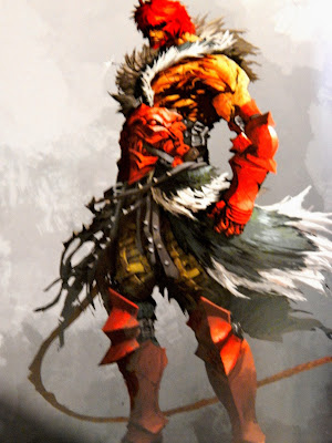
This book goes into tremendous detail in terms of the characters' designs. From simple sketches of each character to their finalized 3D form, this book shows you the process on how characters are designed and how they are crafted into becoming the Belmonts and all of the various enemies and allies.
One of my favorite characters from the series is, undoubtedly, Simon Belmont. Truthfully, I am still kind of intrigued how his recent design made him into a redhead. Remember, I have been following the games from the beginning. At the time, I had always seen him with blonde hair. But, he did go through a change with the release of Castlevania Chronicles for the PlayStation. Even then, I was kind of taken away seeing him with long-flowing red hair.
 |
| Courtesy of Titan Books |
In fact, all of the more popular characters from the series have gone through a major overhaul while also retaining some of their familiarities. Although, Alucard really looks nightmarishly freaky. But, in an awesome way. Satan looks really cool, too.
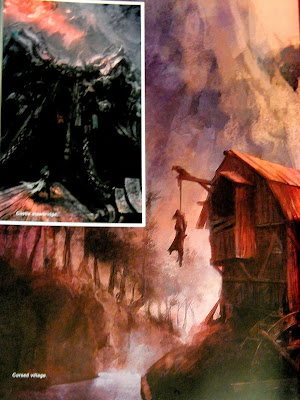
In addition to all of the character designs, there are pages of hand-painted backgrounds which were used in the game itself. The artists have done such a mind-blowing job.
 |
| Courtesy of Titan Books |
Speaking of which, for those die-hard fans out there, Titan Books has also released a special slipcased edition, limited to 500 copies, which includes an exclusive Castlevania: Lords of Shadow 2 concept art print, signed by the whole MercurySteam art team.
Now, we want to hear from you. What do you think about this book and the video games? Would this be a nice addition to your art book library? Tell us what you think in the comments down below.


0 comments: